You already know that each Tailwind utility has a keyword and a value. We spoke about keywords in the previous lesson, so we’re going to focus on values here.
Categorization
Values can be largely grouped into the following five categories:
- Words
- Length values
- T-shirt sizes
- Colours
- Custom properties
- Arbitrary values
The easiest way to understand how these values work is to place them in context with the keyword groupings we’ve identified in the previous lesson. Once again, the keyword groupings are:
displayrelatedwidthandheightmarginandpaddingborderandborder-radius- Font-related
- Colours and gradients
- Others
Words
Words are the most common type of value you’ll find — simply because words are commonly used as CSS values.
Here are some examples:
| Tailwind | CSS Declaration |
|---|---|
grid |
display: grid |
flex |
display: flex |
bg-cover |
background-size: cover |
border-solid |
border-style: solid |
Don’t worry about remembering these values. You might check Tailwind’s docs a couple of times in the beginning, but you’ll quickly grasp the common keywords/values you use.
Length values
Length values are used to properties that accept a CSS <length> value. These are properties that accept units like px, em, rem, ch, and lh.
Tailwind provides the following values for each property that can take a length value:
px— literally1pxauto— literallyauto- A
spacingvalue - A custom property
- An arbitrary value
Spacing values are numbers you attach to a <length> related keyword. By default, each spacing integer represents 0.25rem.
| Tailwind Utility | CSS Property |
|---|---|
m-4 |
margin: 1rem |
p-8 |
padding: 2rem |
w-12 |
width: 3rem |
h-10 |
height: 2.5rem |
You may ask: Why perform complicated math when you can simply write 1rem? Well, what I’ve realized is:
- For values below 3rems: Tailwind’s spacing values provide a huge convenience. (It’s easier to write
m-3thanmargin: 0.75rem). - For values from
3remto5rem: Sometimes I use Tailwind’s spacing values; sometimes I don’t. - For values above
5rem: Calculating spacing values here slow me down so I simply use CSS values by writing arbitrary values.
Width and Height
width and height properties have a couple of extra values they can use:
full- fractions
- container sizes
- And a couple more (like
dvwanddvh) that you will probably never use.
Full sets it to 100%.
Fractions let you write percentages easily without calculating the percentages yourself.
| Tailwind | CSS |
|---|---|
| w-1/2 | Width: 50% |
| w-3/4 | width: 75% |
Container sizes are values that are defined in Tailwind’s container theme values. The default sizes are listed here.
At the time of writing, the default values are:
@theme { --container-3xs: 16rem; --container-2xs: 18rem; --container-xs: 20rem; --container-sm: 24rem; --container-md: 28rem; --container-lg: 32rem; --container-xl: 36rem; --container-2xl: 42rem; --container-3xl: 48rem; --container-4xl: 56rem; --container-5xl: 64rem; --container-6xl: 72rem; --container-7xl: 80rem;}We’ll talk about customizing these values later.
Inset
inset, the shorthand for top, bottom, left, and right, can use the following values along with its longhand counterparts:
full- fractions
Negative Values
Certain utilities can have negative values — like inset and margin. To use a negative value, add - before the utility.
| Tailwind | CSS |
|---|---|
-m-4 |
margin: -1rem |
-l-4 |
left: -1rem |
These are often length or angle related utilities
Borders
Although border-width can take a length value, Tailwind has decided to implement a very different unit system for it.
For borders, you can use these values:
- Numbers
- Arbitrary values
- Custom properties
Numbers do not represent spacing values in borders. Instead they represent the literal number of pixels.
| Tailwind | CSS |
|---|---|
border-1 |
border-width: 1px |
border-2 |
border-width: 2px |
border-3 |
border-width: 3px |
I dislike this system, so I customized it. We’ll talk about that in detail later.
T-shirt sizes
Tailwind has a number of t-shirt sizes littered around its default values. Here are a couple of examples:
Container Sizes:
@theme { --container-3xs: 16rem; --container-2xs: 18rem; --container-xs: 20rem; --container-sm: 24rem; --container-md: 28rem; --container-lg: 32rem; --container-xl: 36rem; --container-2xl: 42rem; --container-3xl: 48rem; --container-4xl: 56rem; --container-5xl: 64rem; --container-6xl: 72rem; --container-7xl: 80rem;}Font-sizes:
@theme { --text-xs: 0.75rem; --text-sm: 0.875rem; --text-base: 1rem; --text-lg: 1.125rem; --text-xl: 1.25rem; --text-2xl: 1.5rem; --text-3xl: 1.875rem; --text-4xl: 2.25rem; --text-5xl: 3rem; --text-6xl: 3.75rem; --text-7xl: 4.5rem; --text-8xl: 6rem; --text-9xl: 8rem;}Box shadows:
@theme { --shadow-2xs: 0 1px rgb(0 0 0 / 0.05); --shadow-xs: 0 1px 2px 0 rgb(0 0 0 / 0.05); --shadow-sm: 0 1px 3px 0 rgb(0 0 0 / 0.1), 0 1px 2px -1px rgb(0 0 0 / 0.1); --shadow-md: 0 4px 6px -1px rgb(0 0 0 / 0.1), 0 2px 4px -2px rgb(0 0 0 / 0.1); --shadow-lg: 0 10px 15px -3px rgb(0 0 0 / 0.1), 0 4px 6px -4px rgb(0 0 0 / 0.1); --shadow-xl: 0 20px 25px -5px rgb(0 0 0 / 0.1), 0 8px 10px -6px rgb(0 0 0 / 0.1); --shadow-2xl: 0 25px 50px -12px rgb(0 0 0 / 0.25);}I don’t like using T-shirt sizes because they’re generally unintuitive to me:
- It takes effort to change
smto3xlbecause these values are so different 3xlmakes it seem it’s SUPER SUPER SUPER large (based on actual T-shits), but it’s only1.875rem(or30px) for font sizes… that seems completely out of proportion
So I use another system for these t-shirt sized values. We’ll talk about this in further detail later.
Color
Tailwind uses a numbered system for colours which range from 50 to 950.
50means ultra light950means ultra dark
Each colour is divided into the following values:
50100200300400500600700800900950
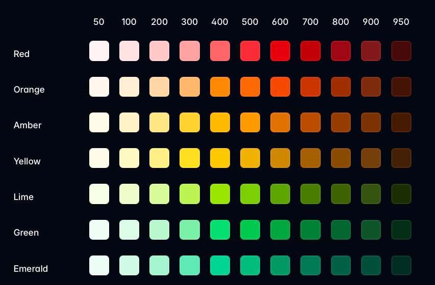
Notice most numbers are in their hundreds (000) except for 50 and 950? Nobody knows exactly why. But I guess the original scale (100 to 900) had insufficient colours.
I think they set 0 to white and 1000 to black as they’re designing the system, so they have to force-fit everything between 0 and 1000. (This is just a guess).
I often don’t use Tailwind colours because:
- I find Tailwind’s darkest colours are still too bright for a dark background
- I don’t want my site to look like others sites created with Tailwind
So I define my own colour palette using Tailwind’s numbers as a guide. Again, we’ll talk about this later in the course.
Using a color
To use a colour, you write the keyword, followed by color, followed by the number, like this:
<div class="bg-red-500">...</div>Custom properties
Tailwind lets you use customer properties as values.
<style>  :root {    --custom-property: some-value;  }</style>
<div class="keyword-(--custom-property)">...</div>
I’ve never found a use for this syntax.
Arbitrary Values
This is the most useful value of all.
Tailwind lets you insert arbitrary values — which basically means you can pass in anything — when Tailwind’s built-in values don’t work for you.
To use an arbitrary value, you:
- Wrap the value with
[square_brackets]. - Ensure there are no spaces (by replacing
spaces_with_underscores).
Here’s are some examples:
| Tailwind | CSS |
|---|---|
p-[1em] |
padding: 1em |
grid-[auto_fr] |
grid-template-columns: auto 1fr |
[--cols:_3] |
--cols: 3 |
Arbitrary values are great when:
- You wanna use units like
emandchthat Tailwind doesn’t provide - You don’t wanna do the mental multiplication for Tailwind’s spacing values.
- You wanna set values for CSS custom properties.
As you can see from the above example, setting grid-[auto_fr] for CSS grid can be quite tedious… so we create a utility to skip that hassle. More on this later.
Likewise, we also create the grid-simple utility so you can adjust the number of columns with CSS custom properties instead of remembering Tailwind’s keywords!
<div class="grid-simple [--cols:3]">...</div>We’ll talk about this in later chapters as well.
That’s it!
By reading through the previous lesson and this one, you’ve gotten a basic understanding of Tailwind’s utility system.
I hope this has helped you understand the docs easily and quickly without having to parse through the nitty gritty details yourself!
Welcome! Unfortunately, you don’t have access to this lesson. To get access, please purchase the course or enroll in Magical Dev School.
Unlock this lesson