How do we use the good parts of Tailwind and the good parts of CSS?
The simple answer is to begin identifying:
- What’s good about Tailwind
- What’s not good about Tailwind
Then we can integrate the good parts and avoid the bad parts.
The Good of Tailwind
The Good of Tailwind is quite obvious when you use it for a couple of projects:
- Good for simple stuff
- Great for one-off manipulations
- Excellent utility system
- Variants are useful for responsive layouts
Good for simple stuff
Tailwind is really useful for adding 2-3 properties to an element. Beyond that, it gets out of hand relatively quickly.
Such properties usually include: max-width, margin, and padding.
<div class="max-w-md mx-auto"> This container has max-width: 768px and margin-inline: auto</div>Great for one-off manipulations
In this category, Tailwind excels at quick manipulations so you don’t have to create a new modifier class.
<!-- Standard Card --><div class="card">...</div>
<!-- Card with smaller padding --><div class="card p-2">...</div>
Excellent utility system
We’ve spoken about this in the previous lesson. But to reiterate, Tailwind’s utility system is more like convenient Sass mixins. You can declare them once and use them everywhere — both in HTML and CSS.
Variants are useful for responsive layouts
We’ll talk more about this in the layouts chapter. But for now, know that Tailwind’s responsive variants are excellent for creating responsive layouts on the fly.
It gets even better when paired with layout utilities like Splendid Layouts. (If not paired, the responsive variants can get out of hand very quickly).
<!-- grid-simple from Splendid Layouts --><div class="grid-simple md:[--cols:3]">...</div>
<!-- Pure Tailwind --><div class="grid md:grid-cols-3">...</div>
The above declarations are not the same — grid-simple contains stuff like minmax declarations to prevent grid blowout, but Tailwind’s version only contains display and grid-template-columns properties.
The “Bad” of Tailwind
The “Bad” about Tailwind is relatively obvious as well:
- It gets out of hand quickly
- Foreign-looking CSS Syntax
- Harder debugging
Gets out of hand quickly
Tailwind’s utilities get out of hand relatively quickly when you include more of them into the same element.
We don’t have to go far to see this happen. Let’s say for example, we have a button that changes background and text color on hover. Something like this is easy to create with Tailwind’s color utilities and the hover variant.
<button class="bg-blue-300 hover:bg-blue-700 text-black hover:text-white"> Button</button>But it gets repetitive — and annoying — if you want to handle other states like focus and active.
<button class=" bg-blue-300 hover:bg-blue-700 focus:bg-blue-700 active:bg-blue-800 text-black hover:text-white focus:text-white active:text-white"> Button</button>It gets worse if you want to handle transition, add border, border-radius, font-size, line-height or other properties.
<button class=" bg-blue-300 hover:bg-blue-700 focus:bg-blue-700 active:bg-blue-800 text-black hover:text-white focus:text-white active:text-white transitions-auto py-2 px-4 rounded text-xs"> Button</button>Maybe you skipped past that huge block of code in the above example. That’s normal. Who would want to read that junk?
CSS is better for things like this because:
- We can keep each rule to one line so they’re easier to read and parse
- We can combine pseudo classes like
hoverandfocuswhen they hold the same rules.
button {  padding: 0.25rem 1rem;  background: var(--color-blue-300);  color: black;  font-size: 1rem;  transition: all ease-out 200ms
  &:hover,  &:focus {    background: var(--color-blue-700);    color: white;  }
  &:active {    background: var(--color-blue-800);    color: white;  }}
That said, CSS is not the best way either — because we can fuse the best parts of Tailwind and the best parts of CSS to create a “pigments system”, so you can style the buttons with CSS variables.
@utility pigment-blue-button { --bg-color: var(--color-blue-300); --bg-hover-color: var(--color-blue-700); --text-color: var(--color-black); --text-hover-color: var(--color-white);}More on this later in the Theming chapter. For now, let’s focus on the “Bad” of Tailwind.
Foreign-looking CSS Syntax
Tailwind’s built-in utilities are simply funky ways of writing CSS.
This means an extra learning curve with little value-add. So if you use Tailwind the way it’s commonly explained, you might as well just stick with CSS!
Since I took on Tailwind, I tried to make the extra learning curve worthwhile — and lo and behold, I created a system that makes it easy to use both Tailwind and CSS together!
Harder debugging
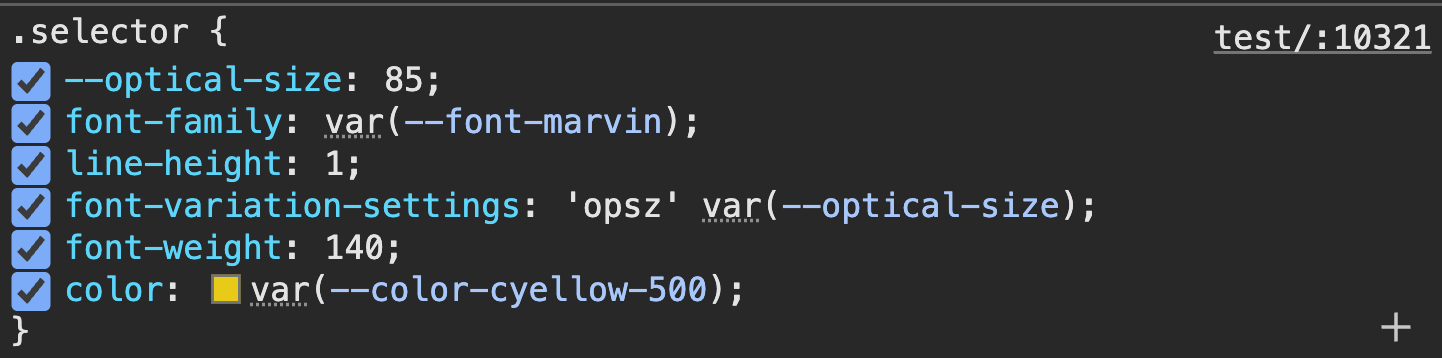
When debugging CSS with Tailwind, you have to adopt an entirely new approach, because you can’t turn CSS rules on or off without affecting the rest of the page.
Here’s what you can see with CSS:
Here’s what you see when you use Tailwind.
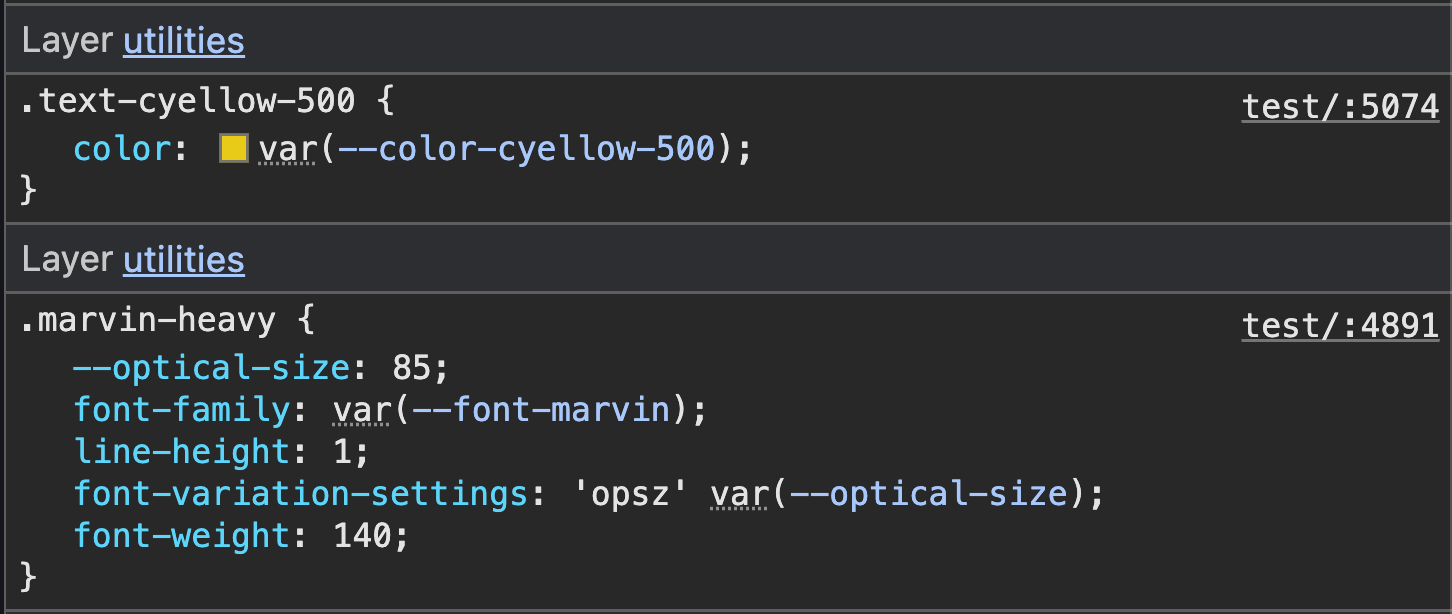
Notice that color is no longer attached to the selector (.marvin-heavy) anymore — this means you have to debug Tailwind CSS differently from normal CSS.
I’ll show you what I do later in the course.
Let’s move onto the first most important step to create an unorthodox system.
Welcome! Unfortunately, you don’t have access to this lesson. To get access, please purchase the course or enroll in Magical Dev School.
Unlock this lesson