I’ve made lots of improvements over Astro’s Image and Picture components, so much so that I’ve built an Image component of my own to house those changes.
You can use it like this:
---import { Image } from '@splendidlabz/astro'---
<Image src="/src/assets/penguin.png" alt="penguin" />
Below, I’m going to detail all of the changes I made — and why — so you understand why it’s necessary to build a custom image component over using built-in Image and Picture.
Problems and Improvements
There are a couple of problems with Astro’s Image and Picture components.
A better importing process
Here’s the first problem. You need to import an image before you can use it. It means you have to write the import statement multiple times if you have multiple images.
This can be a rather tedious process.
---import { Image } from 'astro:assets'import image1 from '../assets/image1.png'import image2 from '../assets/image2.png'import image3 from '../assets/image3.png'---
<Image src={image1} ... /><Image src={image2} ... /><Image src={image3} ... />
I very much prefer the standard way of writing images — where you just write the image’s path into the src.
Upon further testing, I discovered something that Astro doesn’t document — you can import the file directly into the src. This is slightly better than the above, but it’s still not a nice approach.
---import { Image } from 'astro:assets'---
<Image src={import('../assets/image1.jpg')} alt="..." /><Image src={import('../assets/image2.jpg')} alt="..." />
Writing the image path into src is not a trivial process — you need to build a custom image importer (to find the image), then pass the image into Astro’s Image or Picture component.
Here’s an example of this component in its simplest form.
---import { Image } from 'astro:assets'const images = import.meta.glob('/src/assets/**/*.{jpeg,jpg,png,gif,avif,webp}')
const { src, ...rest } = Astro.props
// Building a custom importerconst key = Object.keys(images).find(key => key.startsWith(src))if (!key) throw new Error(`File ${src} not found`)const file = await images[key]()const image = file.default---
<!-- Passing the image to Astro's Image component --><Image src={image} {...rest} />
Once you have done this, you will be able to import the image directly from /src/assets!
---import Image from '@/components/CustomImage.astro'---
<Image src="/src/assets/penguin.png" alt="..." />
The benefit of using an absolute path (/src/assets) is: you get path autocompletion in your code editor.
Setting widths automatically
Second, I think it’s a hassle to set widths for each image individually.
<Image src={image1} widths={[400, 800, 1200]} ... /><Image src={image2} widths={[400, 800, 1200]} ... /><Image src={image3} widths={[400, 800, 1200]} ... />Since we already need to create a custom image component, why not add the default widths values into it as well?
---import { Image } from 'astro:assets'// ...const { src, widths = [400, 800, 1200, 1600], ...rest } = Astro.props// ...---
<!-- Passing the image to Astro's Image component --><Image src={image} {widths} {...rest} />
This is great since we no longer need to write widths when we use each Image.
<Image src={image1} alt="..." /><Image src={image2} alt="..." /><Image src={image3} alt="..." />But there’s a small problem with our hardcoded widths. It remains an invisible problem until you check the output carefully.
Let’s say you have an image at 2560px. Since we only wrote [400, 800, 1200, 1600] into widths, Astro does not wire up the original image into the srcset. Just look at the output and you’ll see this problem.
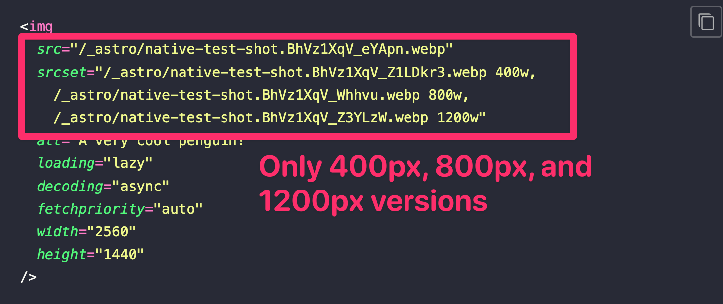
To fix this, we need to get the original image’s width and append that to widths. We also need to filter values that are bigger than the original image.
---import { Image } from 'astro:assets'// ...const { src, widths = [400, 800, 1200, 1600], ...rest } = Astro.props
// ...const image = file.defaultconst finalWidths = [...widths, image.width].filter(  width => width <= image.width,)---
<Image src={image} widths={finalWidths} {...rest} />
Adding Image Formats
Since Astro’s Picture is a superset of its Image component, we can provide formats for free by using the Picture component instead.
---import { Picture } from 'astro:assets'// ...const {  src,  widths = [400, 800, 1200, 1600],  formats = ['avif', 'webp'],  ...rest} = Astro.props// ...---
<!-- Passing the image to Astro's Picture component --><Picture src={image} {formats} {widths} {...rest} />
Figure and Figcaption
Some images have captions, some don’t. This creates styling problems because one image is encapsulated in figure while the other isn’t.
Instead of fretting over whether to style figure, picture or img tags, I wrapped all images in figure even if they don’t have captions. Then, for those with captions, we can always add and style the captions separately.
---import { If } from '@splendidlabz/astro'
// ...const {  src,  caption = '',  widths = [400, 800, 1200, 1600],  formats = ['avif', 'webp'],  ...rest} = Astro.props// ...---
<!-- Passing the image to Astro's Picture component --><figure>  <Picture src={image} {formats} {widths} {...rest} />  <If condition={caption}>    <figcaption>{caption}</figcaption>  </If></figure>
All of these fixes built into Splendid Astro’s Image Component
The Image component I introduced to you above contains all of these fixes and more.
So you just gotta write this:
---import { Image } from '@splendidlabz/astro'---
<Image src="/src/assets/image.png" alt="image" />
And you get the figure + picture output:
<figure> <picture> <source srcset="..." type="image/avif" /> <source srcset="..." type="image/webp" /> <img src="..." srcset="..." alt="..." width="..." height="..." loading="lazy" decoding="async" /> </picture></figure>You can also disable the figure wrapping or use Image over Picture if you need to. Check the documentation for more information.
Welcome! Unfortunately, you don’t have access to this lesson. To get access, please purchase the course or enroll in Magical Dev School.
Unlock this lesson