We have already completed the modal animation with CSS, but I still want to show you how to use GSAP to animate the waving hand. This will help you learn to use GSAP in a real project.
Since we are going to create the waving hand animation with GSAP, you need to remove (or comment) the animation from the CSS.
/* Remove these parts */@keyframes zoom { /* ... */}
@keyframes wave { /* ... */}
.modal-is-open .wave-hand { /* ... */}First, we need to add GSAP to the project:
<script src="https://cdnjs.cloudflare.com/ajax/libs/gsap/1.20.3/TweenMax.min.js"></script><script src="js/main.js"></script>Next, we need to select the waving hand with JavaScript.
const wavingHand = document.querySelector('.wave-hand')We want the hand to have an animation when the modal opens. Here, we can create a wave function that tells the hand to wave. We only use wave when we open the modal.
// Wave hand animation herefunction wave() { // ...}
// Opens modalmodalButton.addEventListener('click', event => { document.body.classList.add('modal-is-open') wave()})Creating the animation
Our waving hand animation contains many parts:
- The zoom
- Wave left (your right)
- Wave right (your left)
- Wave left
- Wave right
- Back to middle
Since the animation contains many parts, we want to use TimelineMax. With TimelineMax, we can chain many tweens together easily.
function wave() { const tl = new TimelineMax({})}Creating the zoom animation
Here’s how we created the zoom animation with CSS Animations:
@keyframes zoom { 0% { transform: scale(0.25); opacity: 0; }
100% { transform: scale(1); opacity: 1; }}
.wave-hand { animation: zoom 0.5s cubic-bezier(0.18, 0.89, 0.32, 1.28);}We changed two things during the animation:
scalefrom 0.25 to 1opacityfrom 0 to 1
If we don’t write any code, we know .wave-hand already has a scale of 1 and an opacity of 1. If we want to create the animation, we want to animate from scale 0.25 and opacity 0.
We can create a from animation with the from method.
function wave() { const tl = new TimelineMax({}) tl.from(wavingHand, 0.5, { scale: 0.25, opacity: 0, })}We used a “backward” cubic bezier timing-function for the animation. In GSAP, the “backward” cubic-bezier equivalent is Back.easeOut.
function wave() { const tl = new TimelineMax({}) tl.from(wavingHand, 0.5, { scale: 0.25, opacity: 0, ease: Back.easeOut.config(1.5), })}
Note: The red squiggly underlines beneath TimelineMax and Back are because Standard (the linter) doesn’t recognize them as variables. See the linter lesson on how to remove these underlines.
Creating the wave animation
Here’s the wave CSS Animation.
@keyframes wave { 0% { transform: rotate(0); } 20% { transform: rotate(15deg); } 40% { transform: rotate(-15deg); } 60% { transform: rotate(15deg); } 80% { transform: rotate(-15deg); } 100% { transform: rotate(0); }}When you use GSAP, you don’t care about the points (at 20%, at 40%, etc). You care about what happens between these points. You also care about the amount of time between the points.
From 0% to 20%, you want the hand to rotate to your right. Here, you use the to method. The duration of this movement is 0.2 seconds.
function wave() { const tl = new TimelineMax({}) tl.from(wavingHand, 0.5, { scale: 0.25, opacity: 0, ease: Back.easeOut.config(1.5), }) tl.to(wavingHand, 0.2, { rotation: 15 })}From 20% to 40%, we want the hand to rotate to the left. It should end up at a -15deg rotation; we can continue chaining the wave animation with to.
function wave() { const tl = new TimelineMax({}) tl.from(wavingHand, 0.5, { scale: 0.25, opacity: 0, ease: Back.easeOut.config(1.5), }) tl.to(wavingHand, 0.2, { rotation: 15 }) tl.to(wavingHand, 0.2, { rotation: -15 })}Then to the right, and left, and back to 0.
function wave() { const tl = new TimelineMax({}) tl.from(wavingHand, 0.5, { scale: 0.25, opacity: 0, ease: Back.easeOut.config(1.5), }) tl.to(wavingHand, 0.2, { rotation: 15 }) tl.to(wavingHand, 0.2, { rotation: -15 }) tl.to(wavingHand, 0.2, { rotation: 15 }) tl.to(wavingHand, 0.2, { rotation: -15 }) tl.to(wavingHand, 0.2, { rotation: 0 })}Finally, we need to set transform-origin to make sure our hand rotates from the bottom center. Here, we use the set method.
function wave() { const tl = new TimelineMax({}) // Sets transform origin tl.set(wavingHand, { transformOrigin: 'bottom center' }) tl.from(wavingHand, 0.5, { scale: 0.25, opacity: 0, ease: Back.easeOut.config(1.5), }) tl.to(wavingHand, 0.2, { rotation: 15 }) tl.to(wavingHand, 0.2, { rotation: -15 }) tl.to(wavingHand, 0.2, { rotation: 15 }) tl.to(wavingHand, 0.2, { rotation: -15 }) tl.to(wavingHand, 0.2, { rotation: 0 })}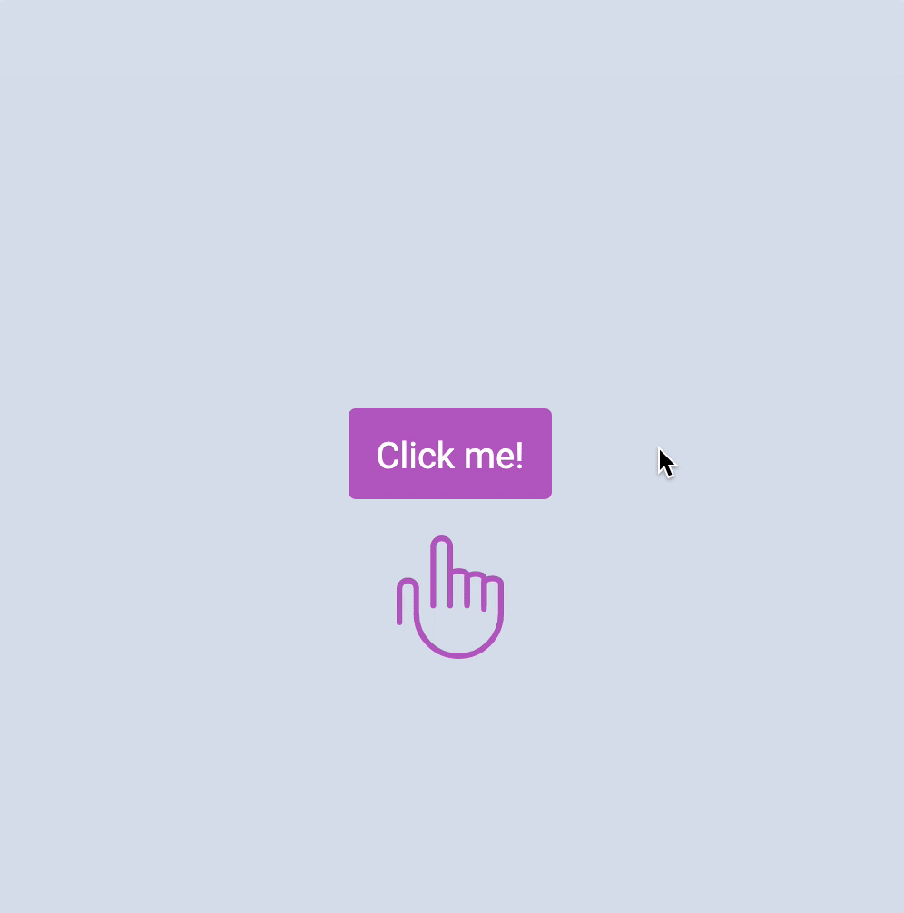
That’s it! Bye bye!
Welcome! Unfortunately, you don’t have access to this lesson. To get access, please purchase the course or enroll in Magical Dev School.
Unlock this lesson